I went on a day trip to Saltaire and looked around the Mills. There is a large bookshop in the Mills as well as good artists books floor. Throughout second year I've found an appreciation for publications and find when I visit places such as this particular books, or elements of books stand out to me. I took photos of specific things that peaked my interest when on this trip.
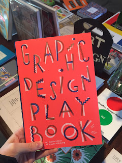
Publication: Graphic Design Playbook
- It was the bright playful cover that grabbed my attention with this book, as well as the typeface, they worked very well together.
- The publication is an original introduction into graphic design, the concept is really interesting and I felt the content was very similar to the approach of my uni course.
- It demonstrated a clear understanding of the elements within typography, presenting topics such as typography visual identities and poster.
- It was a really unique publication, I hadn't seen anything that approached graphic design in this way before, it felt as though it was a series of workshops rolled into a publication.
Publication: How the hidden rules of design are changing the way we live, work and play
- The thing that jumped out to me most with this publication was initially the blue dots on the cover, and when I picked it up I noticed there was a more intricate pattern embossed onto the cover.
- Details like this within publication is something that makes them so unique and interesting to me, with physical publication there are design decisions you can make that only apply to physical design.
History Exhibition in the Museum
- In the museum section of the mills there were displays of artefacts from the mill years ago. These had a very clear aesthetic, due to the typeface used and layout (as well as the content of the objects).
- The type was so from a time but I noticed how specific styles, letter press, and in particular the type used on the fire safety boards are coming back into fashion within design.
- The objects had so much character, partly due to the design and partly due to the history they held, found this combination very interesting.
Mid Century Advertising
- These two were interesting in their layout and design, they had the same aesthetic as the iconic 'lemon vw' ad.
- They had a very dated feel to them, but the idea of the design I really liked, the use of photo and type really caught my eye.
- I'm not sure what these adverts were for as I moved to another room quite quickly, but would really like to find out more, maybe research further into this style of design and how it could be applicable to a more modern topic.


No comments:
Post a Comment