Feel as though the traditional methods could be limiting within the design, want to try and communicate the message of 'hidden' through the type (if this is possible), while still remaining practical.
Da - Ori Studio
In order to create an environment which encouraged open dialogue, the pair removed themselves as interviewers altogether, instead, allowing the contributors to lead the conversation. As a result, da大 sees participant (a) asking a question to participant (b), who after answering asks a question to the next person down the list, “so as to achieve a more natural and autonomous form of dialogue”, they add. The only prompt given to each contributor was the topic and an introduction to the other participants, leading to a wide-ranging conversation far beyond that which Maxim and Xuechen could have predicted.
In terms of its design, da大 allows this conversation to dominate. The main section is bilingual, (Chinese and Japanese) and so the typography is arranged so that the languages merge “to form cohesive patterns which flow down the page”. Subtle elements like silver ink and thin paper which allows images on the opposite side to show through, add depth without comprising the reading experience.


- The layout of the publication is really interesting, how the pages fold out and you can see the text and image through the paper as it's so thin.
- Like the use of thin paper, would need to plan the sourcing of this as I know thin paper stocks are difficult to find (look in digi print, kodatrace?) - The very simple layout allows the text to be the main focus, this is fitting as it's arranged in such a way that it is a piece of complex design itself, it isn't just placed on the page.
- However, there is a clear structure to the interviews. - The inclusion of imagery is really nice too, the format compliments the text, they don't fight each other, simply live alongside one another.
- How would I use my text, some answers there are a lot of words others are short (especially in comparison to my questions), need to think about this further within the final outcome.
Little White Lies Magazine
I bought this magazine a while ago and decided to look into the interviews and the ways they're structured. There are a few different ways, all fairly traditional.


I bought this magazine a while ago and decided to look into the interviews and the ways they're structured. There are a few different ways, all fairly traditional.

- This one was more of a monologue set up, there weren't obvious questions and answers.
- Feel as though this wouldn't be applicable to my creative report as I want there to be a distinction between the questions and the answers. I think the structure would be beneficial to the reader.


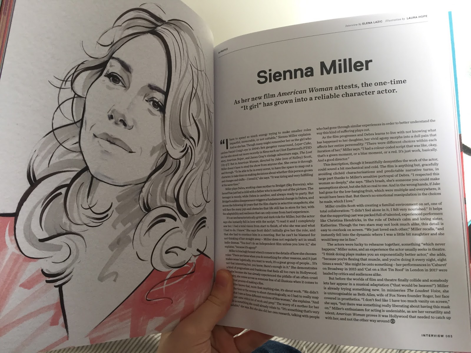
- More of a divide in this one, questions and answers broken up by a hierarchy of bold and regular type.
- The format is in smaller columns than the previous interview, I think this makes it easier to read also, especially due to the small type. There aren't too many words on one single page.
- The text also have the name of the person then what they said, like a script. This would be applicable with Dust as there were 3 people within one interview, but at Peter and Paul it was just myself and Dan so could get away without this in that interview.


- This interview is between two people and doesn't have the names for the people, I prefer this, just having the differences in type being enough.
No comments:
Post a Comment